01
The original Amplift — and the real problem
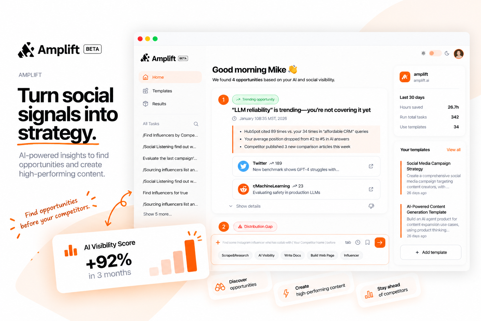
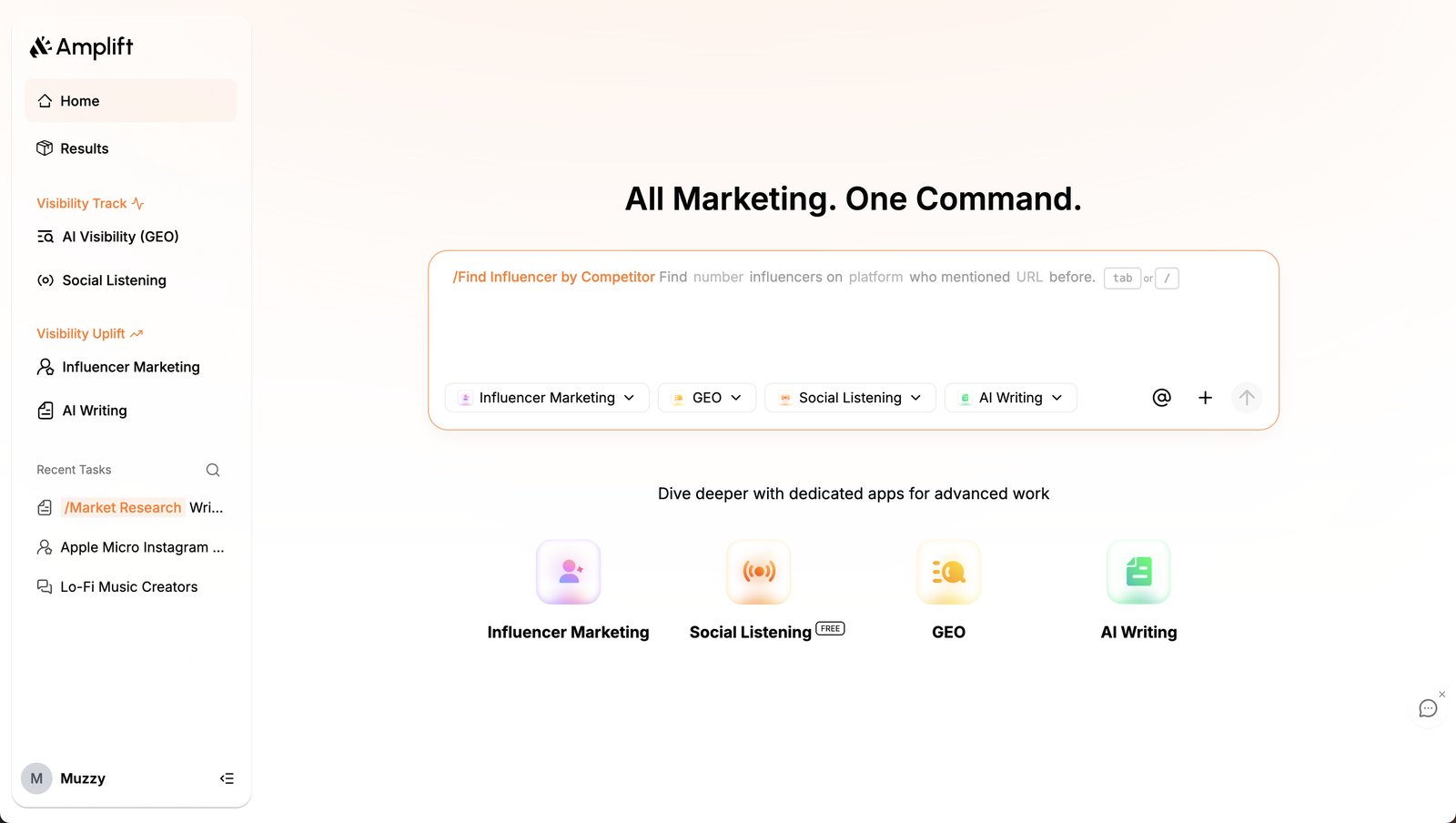
Original Amplift — command-bar home requiring users to already have a task in mind. Flat sidebar with no hierarchy between Visibility Track features and Visibility Uplift tools. As the feature set grew, the model broke down.
The original Amplift used a command-bar model — a single input field at the center of the home page, waiting for users to tell it what to do. That works for power users who arrive with intent. It fails for everyone else, and it failed harder as the product matured.
The Real Problem
The command-bar model assumed high intent. But Amplift's value proposition is discovering opportunities users didn't know existed. A blank prompt defeats that entirely — the product's intelligence was invisible until you typed something.
The Goal
Redesign the home page so AI-detected opportunities lead the experience. Users should arrive, immediately see what to act on, and have a clear path to execute — without typing a single command.
My Role
End-to-end product design — user flows, competitive analysis, two rounds of iteration with testing, A/B navigation test, and final delivery. Working directly with 1 PM and 1 lead engineer in a 1-month sprint.
Constraints
1-month timeline · Existing users with established workflows (can't break muscle memory) · AI surfacing must feel helpful, not intrusive · Backend constraints on real-time opportunity generation
AI ProductsNavigation DesignInformation ArchitectureSaaSConsumer
02
Research — competitive analysis and user flow mapping
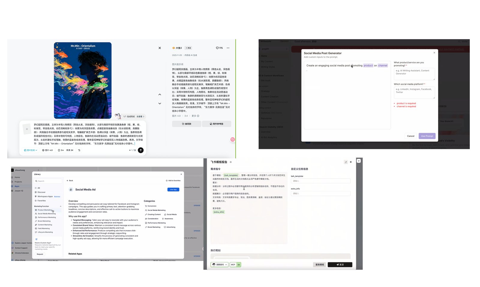
Competitive analysis — 10+ AI marketing platforms benchmarked on how they surface AI-generated intelligence. Key finding: the strongest platforms treat the home page as a personalized briefing, not a navigation menu.
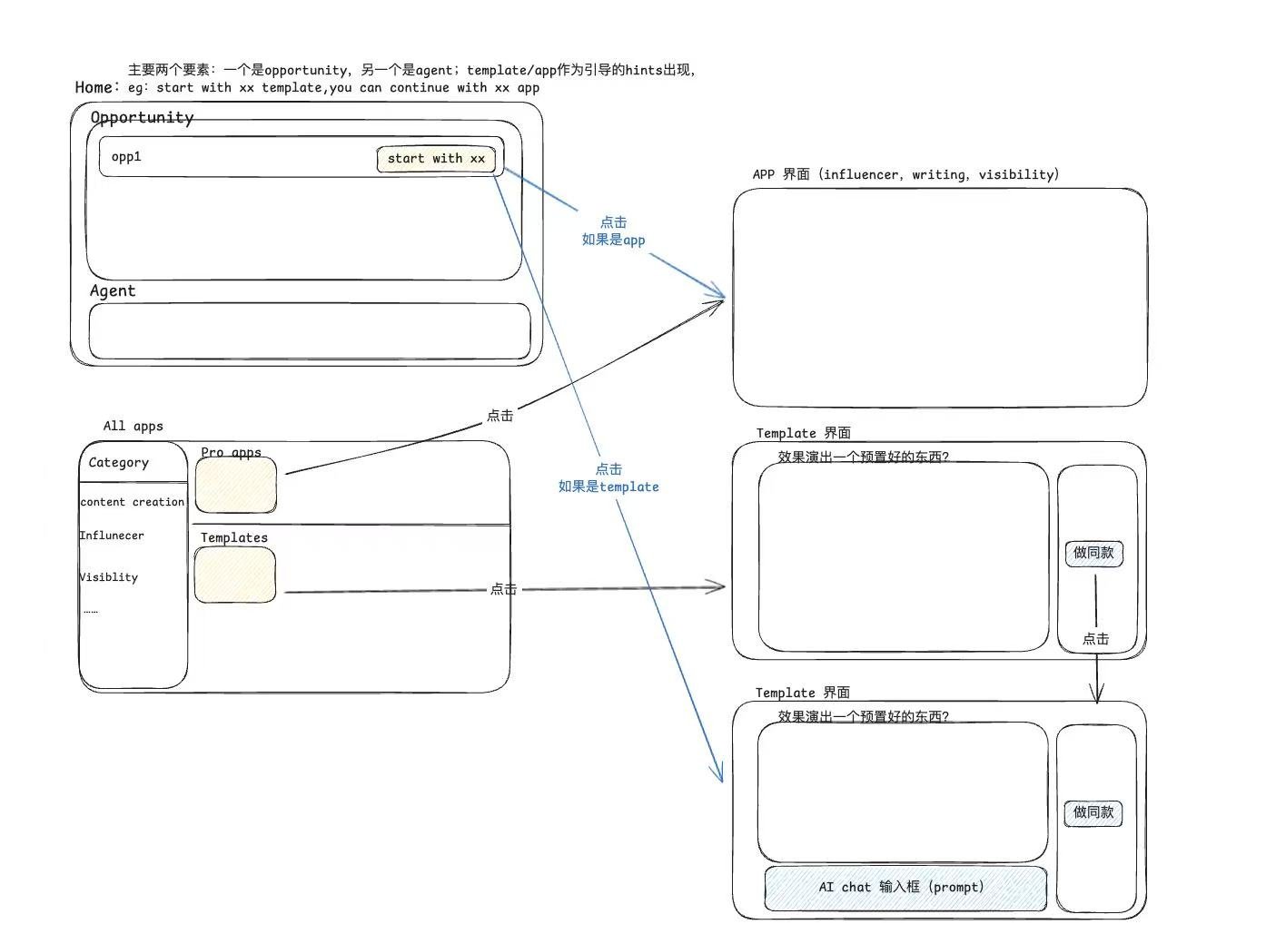
User flow mapping — two core entry points: Opportunity cards (AI-detected, proactive) and Agent commands (user-initiated, intent-driven). Templates and apps surface as guided hints within each path, reducing blank-page friction.
"The core issue wasn't a lack of features — it was that the home page required users to already know what they wanted, before the AI had a chance to tell them."
— Design insight from audit
Navigation Audit
The flat sidebar had no hierarchy between high-frequency features (Opportunities, Results) and deep tools (AI Visibility GEO, Social Listening). Every visit required the same mental scan.
Home Page Audit
The command bar assumed intent. Users who weren't sure what to ask got nothing. The product knew about trending gaps and competitor moves — but hid all of it behind a blinking cursor.
10+
Competitors analyzed
HubSpot, Jasper, Sprout Social, Copy.ai, and others — benchmarked on how AI value is surfaced on home
3
Design principles
Surface don't bury · AI as co-pilot not gatekeeper · Reduce time to first action
2
Navigation patterns
Traditional sidebar vs Apple-style dock — each tested with real Amplift users on complex workflows
03
Iterations — two rounds, two different hypotheses
Iteration board — V1 tested a dashboard-first model leading with performance metrics. V2 pivoted to a chat/agent model. Each iteration was tested internally before the next round was designed.
V1
Dashboard-first — metrics and onboarding
Five screens tested: unfinished onboarding state, return user state, Opportunities list, Agent command bar, and Pro Apps. The home led with AI Visibility Score, Industry Ranking, Share of Voice — a performance dashboard.
Why it didn't landMetrics tell you how you're doing, not what to do next. Users still had to navigate to find actionable opportunities. The onboarding banner created a "not done yet" feeling that persisted even for active users.
V2a
Chat/Agent home — new user state
Pivoted the home to an AI command interface: "All Marketing. One Command." New users without completed onboarding saw the agent prompt + Typical Templates. A second screen explored a guided setup flow.
What we learnedTemplates genuinely helped new users get started. But the command bar still required intent — users who didn't know what to type were stuck. The chat interface felt unfamiliar as a home page for a marketing tool.
V2b
Completed onboarding — two options tested
Option 1 combined agent command + Opportunities list in one view. Option 2 was agent command only, cleaner. Testing notes from the session: "chat not obvious," "主要还是 opportunity," "template不要太明显." Users kept navigating to the Opportunities page.
The decisive findingUsers didn't want to command the AI — they wanted the AI to tell them what to do. Opportunities needed to lead the home page, not sit on a separate page. The command bar could stay, but as a secondary entry point.
04
Final design — opportunities first, navigation refined
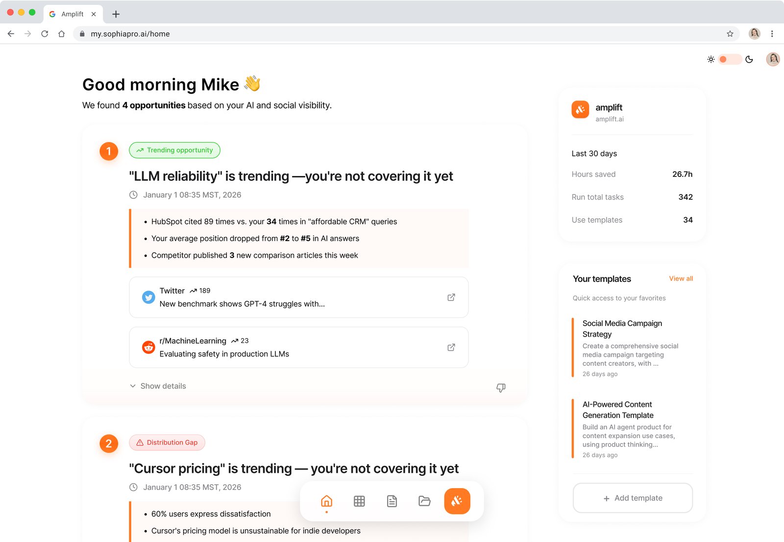
Redesigned home page — AI-detected opportunities ranked by impact lead the page. The command bar stays as a secondary entry point for intent-driven users. Templates panel on the right for quick access. Sidebar navigation replaces the original flat structure.
04 A/B
Navigation A/B — sidebar vs dock
Version A — Sidebar ✓ Selected
Version B — Dock
Sidebar vs Dock — A/B tested with Amplift power users managing multi-step campaign workflows. Sidebar won on spatial consistency; dock caused disorientation when switching between research, content, and reporting tasks.
04 Templates
Templates before and after
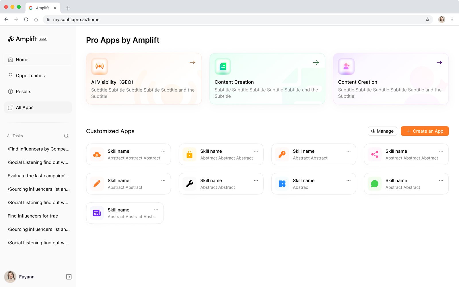
Before — Pro Apps grid
After — Searchable gallery
Templates — before (flat grid, no indication of what each template produces) vs after (searchable gallery with category filters, example output per template, and "Have a Try" CTA that lowers commitment before users dive in).
01
Opportunities lead the home page
The final design brings the Opportunities page to the home — AI-ranked by impact, with direct action buttons per item. The command bar remains for power users who arrive with intent, but it's no longer the first thing you see.
02
Sidebar navigation over dock
Spatial consistency won. Users managing multi-step workflows across research → content → reporting need a stable left rail they can glance at without re-orienting. Dock's visual appeal didn't outweigh the orientation cost.
03
Templates with output previews
Iterations showed templates genuinely help new users start. The key change: showing what each template produces before committing. "Brand Analysis.html," "Sentiment Report.pdf" — concrete outputs reduce hesitation more than any CTA copy.
05
Results
Influencer discovery
5x
Faster — measured by average sessions to first influencer shortlist, before vs after launch
Research efficiency
60%
Time saved per research task — self-reported in post-launch user survey across 40+ active accounts
Campaign setup
3x
Faster first campaign completion — tracked via funnel analytics from home page to first published result
Support tickets
40% ↓
"How do I find X" tickets — tracked in Intercom, first 30 days post-launch vs previous 30 days
"The templates helped me launch our first email campaign in half the time. I didn't have to figure everything out from scratch."
— Marketing Manager, E-commerce Startup
"As a solo marketer, having the AI tell me what to focus on first is exactly what I needed."
— Small Business Owner
What I learned
The biggest mistake in V1 was confusing "performance information" with "actionable intelligence." Metrics tell you where you stand. Opportunities tell you what to do next. Users didn't want a dashboard — they wanted a co-pilot that had already done the analysis and was waiting to hand them the answer.
The iteration process was the most valuable part of this sprint. V1 felt logical — of course users want to see how they're performing. Testing showed otherwise. V2's pivot to agent-first felt bold — and testing showed that was half-right. The real insight came from watching users in V2b consistently navigate away from the command bar to the Opportunities page. They were telling us the answer; we just had to listen.
AI UXNavigation DesignInformation ArchitectureA/B TestingBefore / AfterSaaS