Dashboard first
What we triedA home that led with AI Visibility Score, industry ranking, and share of voice.
What we sawMetrics explained performance but not what to do next. Users still left to find opportunities.
Selected work, by invitation.
Enter the portfolio password to view this project.
Back to selected workAI marketing · Product redesign
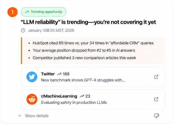
I redesigned the home page and navigation so users see the AI-detected opportunities worth acting on before they have to decide what to ask.
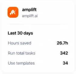
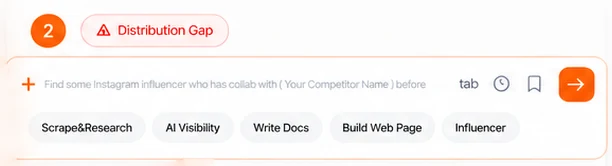

I owned research, user flows, two rounds of design and testing, a navigation test, and handoff. Watching users move through the product led me to change the home page without breaking the workflows they already used.
Problem
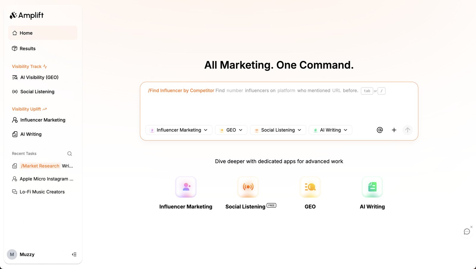
Amplift is an all in one AI marketing platform for small and midsize businesses. It could detect competitor gaps, trending topics, and influencer matches. But the home page was a single command bar, so users had to know what they wanted before the product showed them anything useful.
 123
A blank command bar works for users who arrive with a task. Amplift’s value was showing opportunities they did not know about yet.
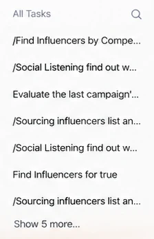
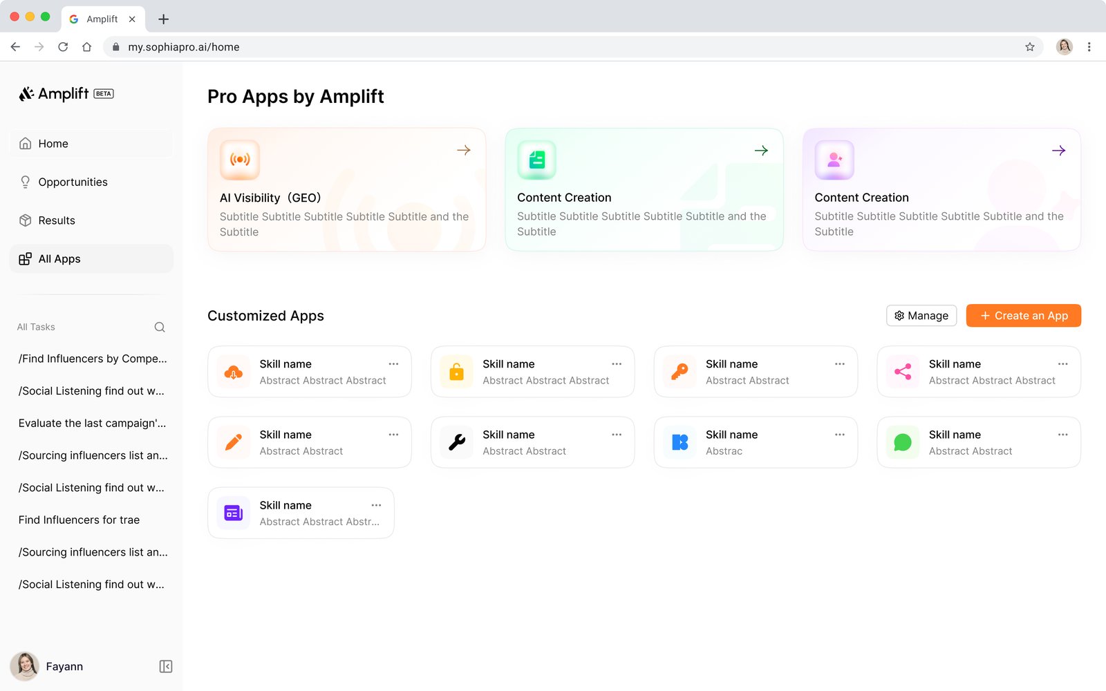
Frequent tasks and deep tools sat in one flat list. As features grew, every visit meant another scan.
Apps were listed by name only, so users could not tell what each one would produce.
 445
Pro Apps and Customized Apps looked alike. Nothing said which one to use, or why there were two.
Cards showed a name and a short label, not what each app does, so users did not know how to start.
One month, requested directly by leadership. I had to ramp up fast in a new domain, and the AI behavior was already defined. Existing users had habits we could not break. AI suggestions had to feel helpful, not pushy, and the backend limited how fresh opportunities could be.
Research
I benchmarked more than ten marketing platforms, including HubSpot, Jasper, Sprout Social, and Copy.ai, and mapped how users enter Amplift today. I also talked with stakeholders and small business marketers.
We agreed on the problem and what success would look like, set scope and timeline, and named the risks to workflows people already relied on.
Many tools onboard through AI chat, but few guide people at the very first step. Templates were the most effective way to help users get started with AI.
I asked about first use pain points and expectations. Clarity and trust mattered more than feature depth.
Marketers with very different levels of experience. The gap: too many options, not enough direction.
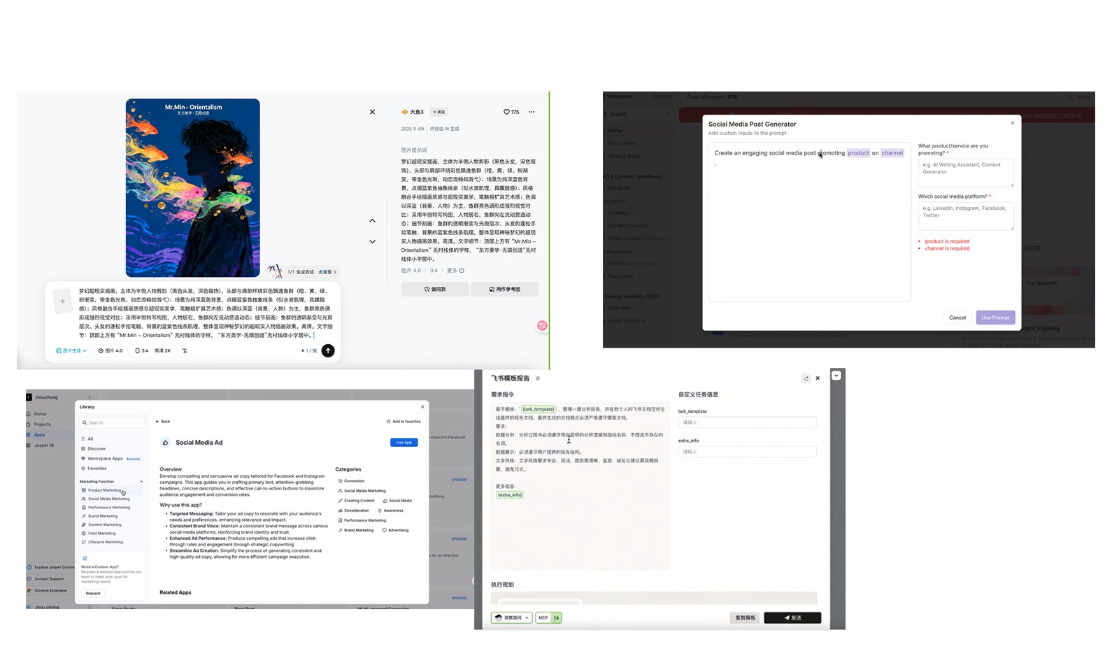
Strong platforms open with what changed and what to do about it, not with a menu.
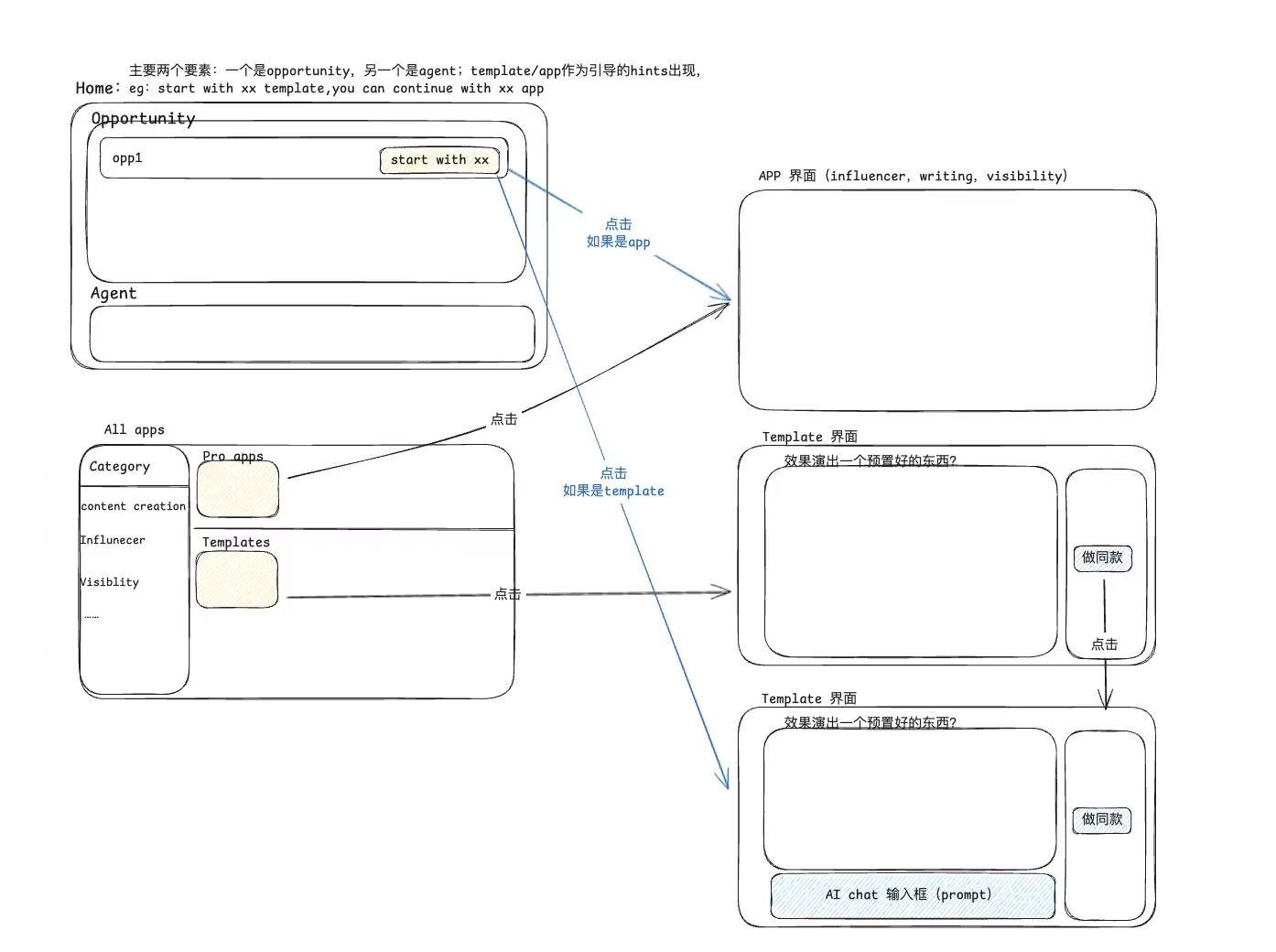
Opportunity cards for users who want ideas, agent commands for users who arrive with a task. Templates help on both paths.
The questionHow might we help users quickly understand where to start and reach value in a complex marketing platform?
Show users what to act on first. Keep the command bar for people who already know what they want.
More people take a first meaningful action, reach their first insight sooner, and follow through on what the AI suggests.
More trials turn into active use, fewer people drop off early, and the core AI capabilities get used.
Fewer onboarding tickets and errors.
Iterations
The first round led with performance metrics. The second led with an agent prompt. Testing showed that neither should replace the opportunities users came for.
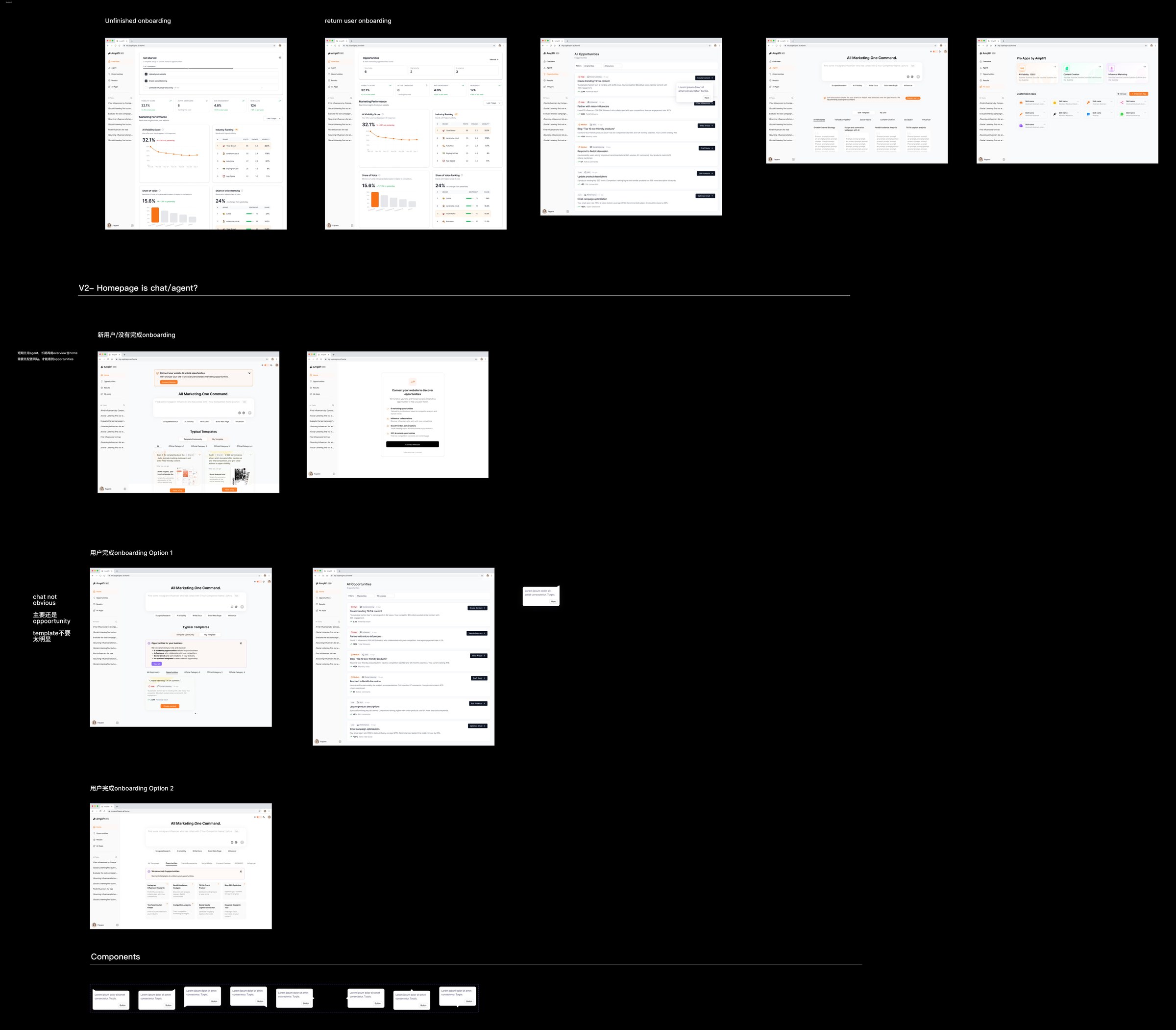
I mapped the key flows first, then explored IA options before the team aligned on a direction.
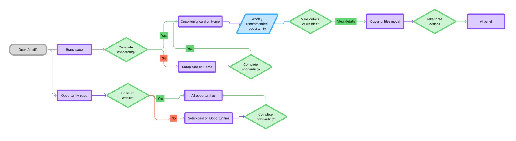
From the home page, users finish onboarding and land on an opportunity card. From the opportunity page, they connect a website and see every opportunity.
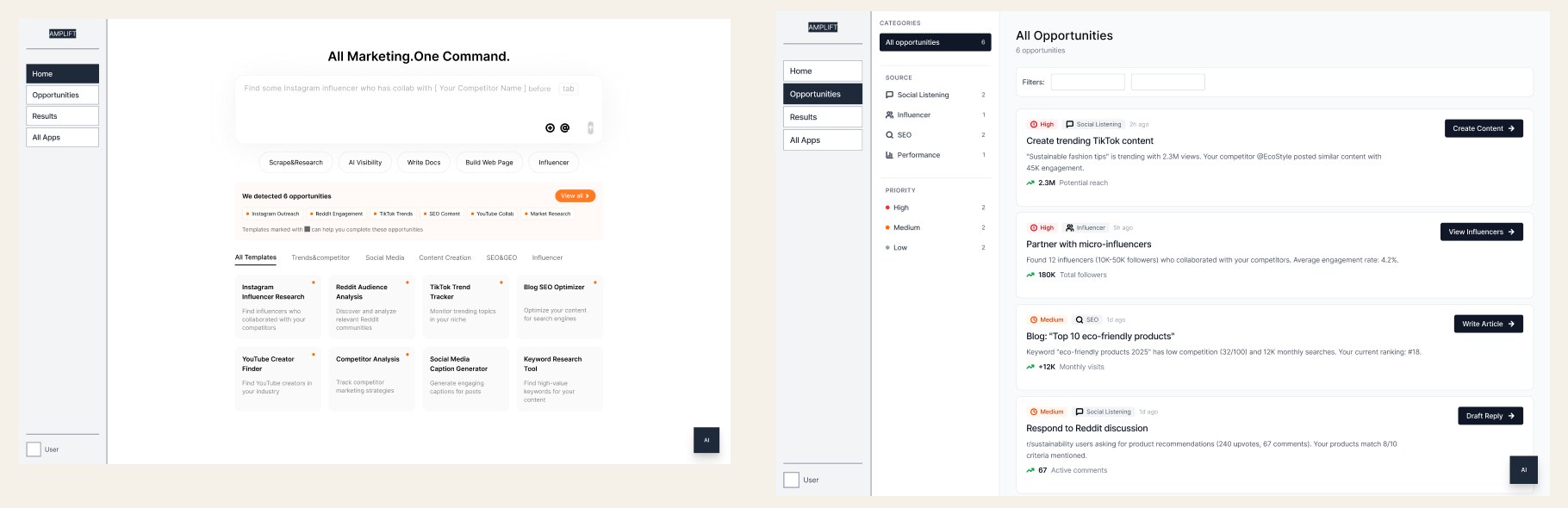
The command bar stayed on the home page, with opportunities on their own page.
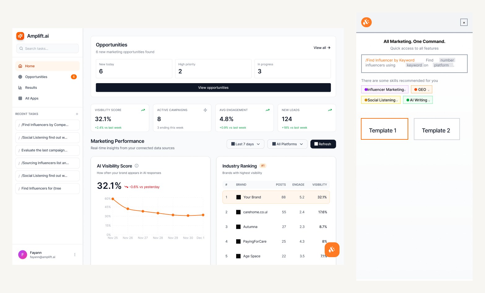
Opportunities and performance led the home page, and commands moved into a side panel.
What we triedA home that led with AI Visibility Score, industry ranking, and share of voice.
What we sawMetrics explained performance but not what to do next. Users still left to find opportunities.
What we triedA command home with suggested templates, tested with and without an opportunities list.
What we sawTemplates helped new users start, but the empty prompt still needed intent. Users kept going back to the Opportunities page.
Users did not want to command the AI. They wanted it to tell them what to do. So ranked opportunities moved onto the home page, with the command bar as a second way in.
Feedback from the PM and co-founder
Onboarding felt straightforward, navigation was simpler, and templates made it easier to start.
Opportunity cards showed too much and did not make the value or the action clear.
Simplified each card around quick stats, quick templates, recommended actions, and sources.
Product Design
The new home ranks opportunities and puts the action next to each one. A stable sidebar supports research, content, and reporting work.
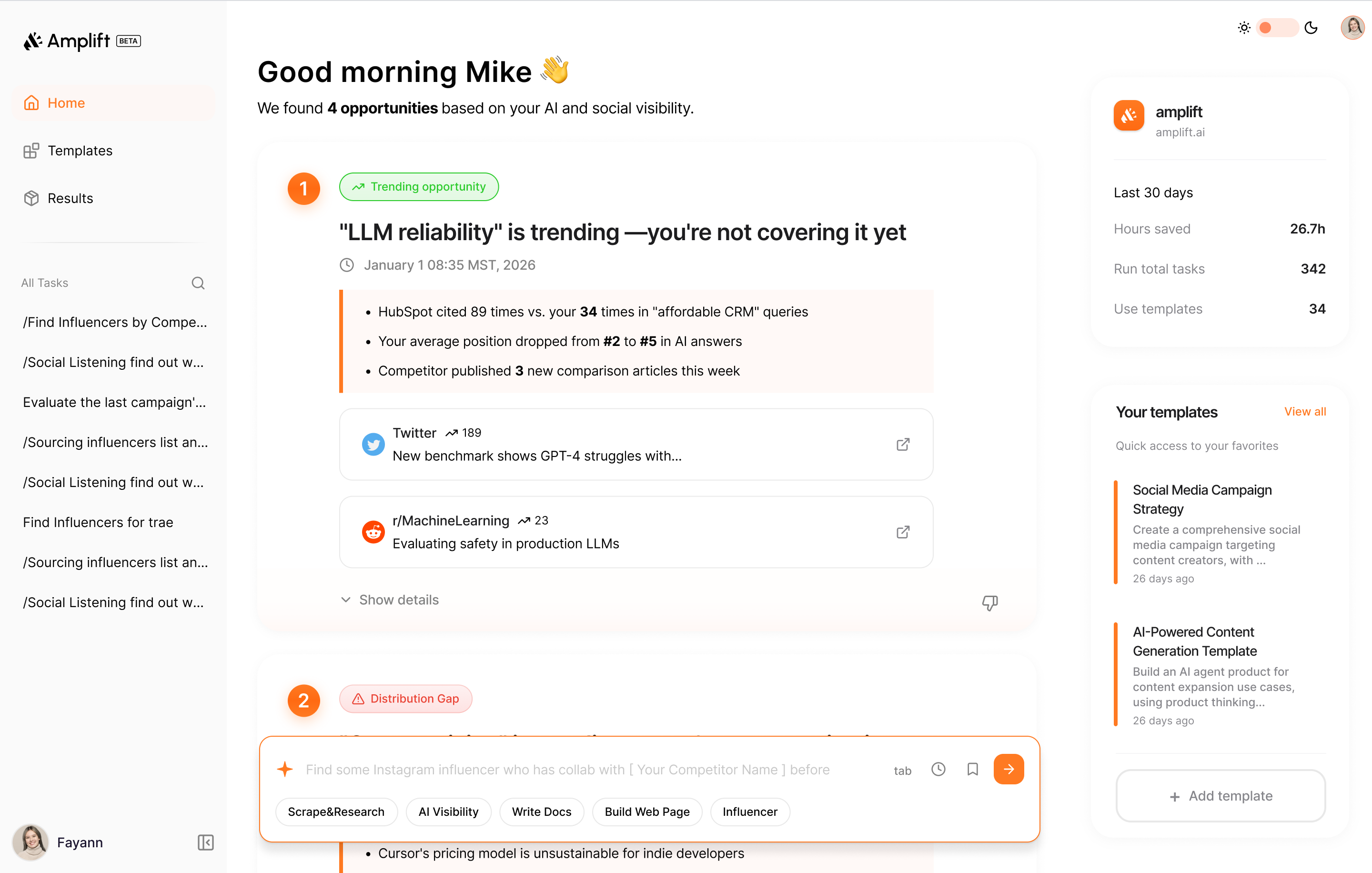
Ranked opportunities fill the main area. The command bar sits below, and saved templates sit on the right. A fixed sidebar keeps every tool in the same place.
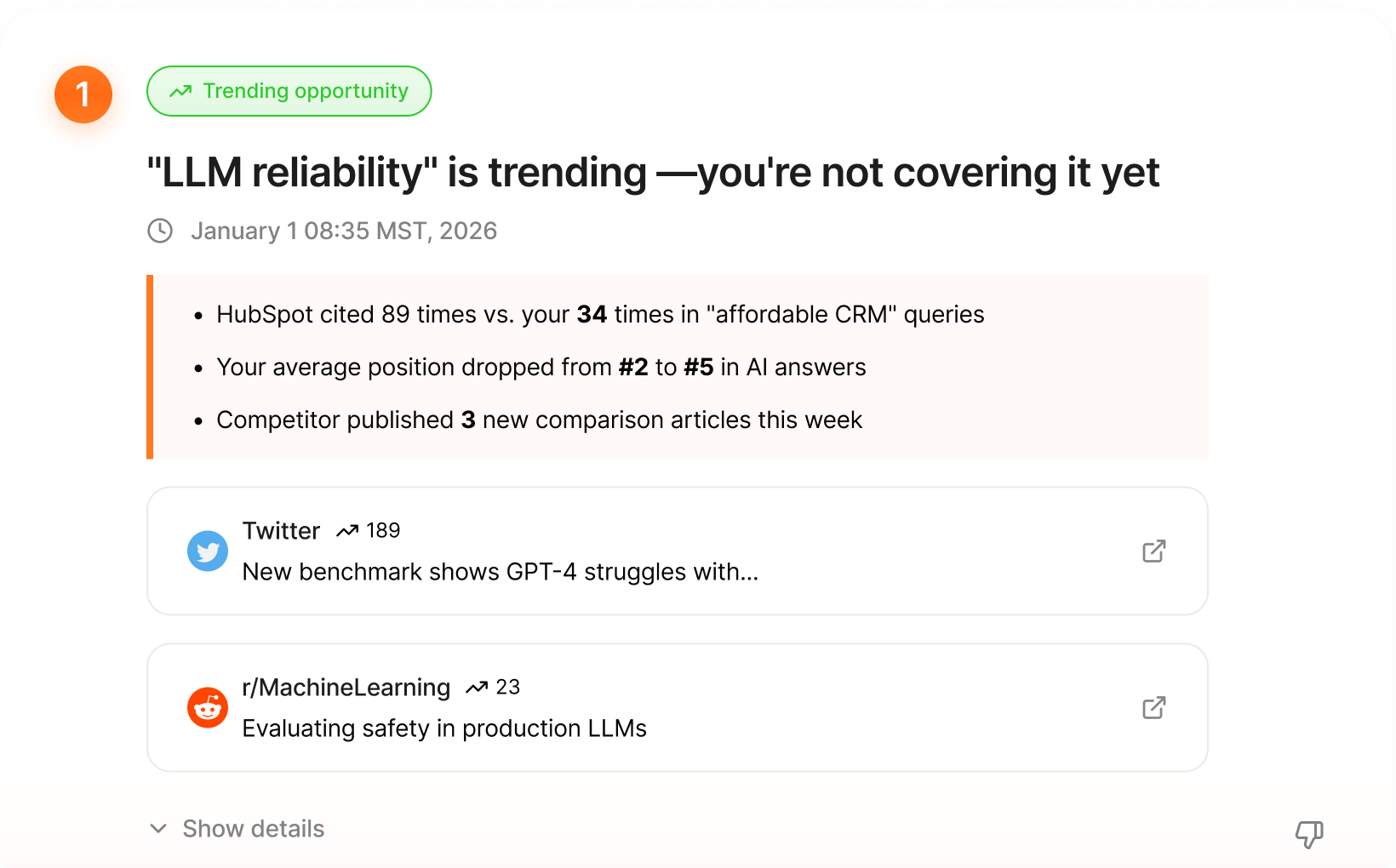
Each card says what changed, why it matters, and where the signal came from, so users can trust it before acting.
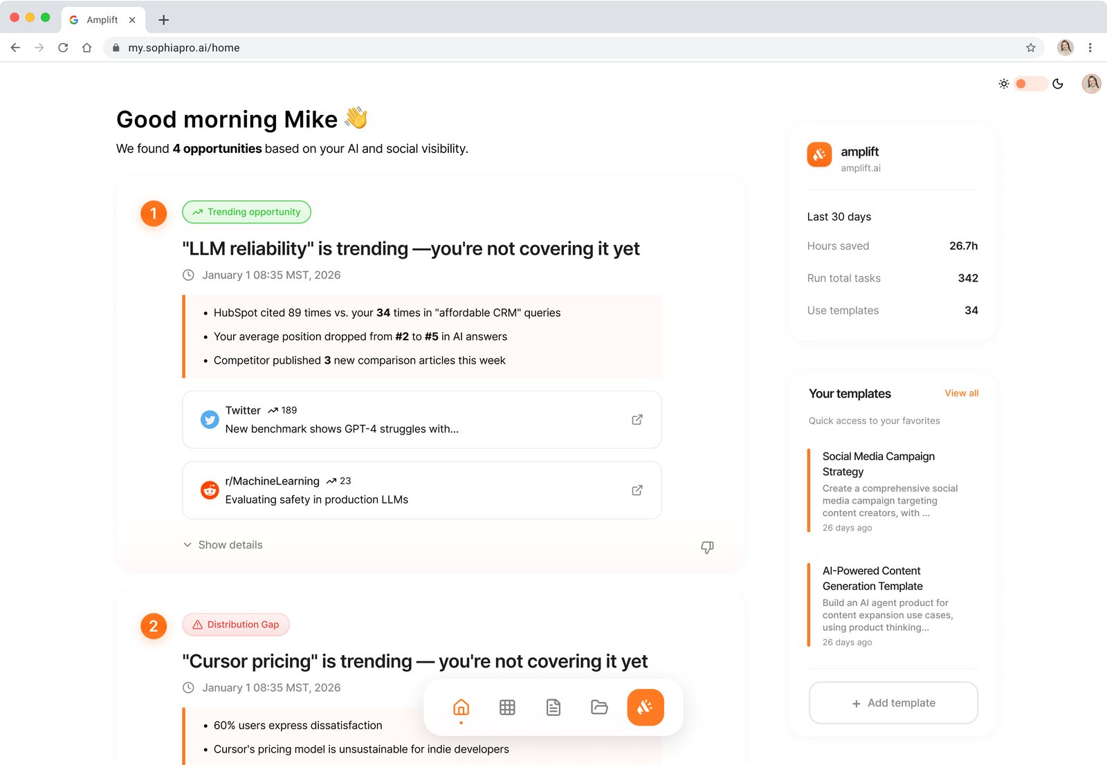
We tested a dock against the sidebar with real users. Moving between research, content, and reporting was easier when tools stayed in one place, so the sidebar won.
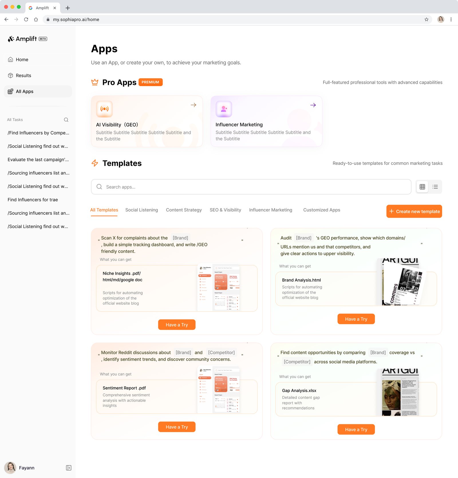
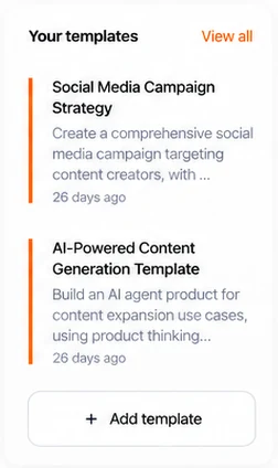
Each template shows what you get, such as a report or a tracking dashboard, with one button to try it.
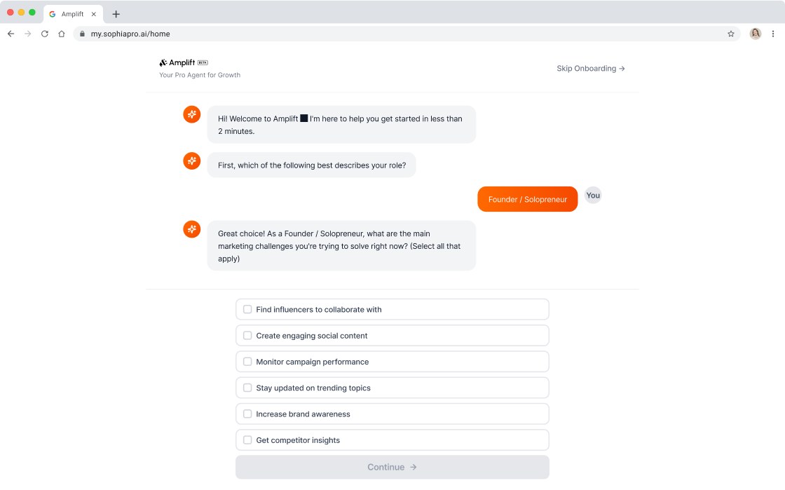
New users set up Amplift by answering a few questions in an AI chat, which then points them to the right starting point.
Results
Results from the beta release, tested internally before the public launch.
To reach the first meaningful insight.
Spent figuring out where to start.
Increase in key workflows completed.