Case Study — 01

Keap Pay

WePay — Keap's embedded payment processor — was acquired by Chase and shut down for third-party integrations. Thousands of active merchants suddenly couldn't collect payments. I had five months to build a replacement from scratch, migrate 70% of affected customers, and ship it without breaking anyone's existing business.

RoleSole Product Designer
TimelineOct 2023 – Feb 2024
Duration5 Months
TeamProduct, Engineering, Payments
$70M+
Transactions processed via new system
73.9
SUS score — above industry average
+30%
Payment volume increase post-launch
70%
WePay customers migrated on time
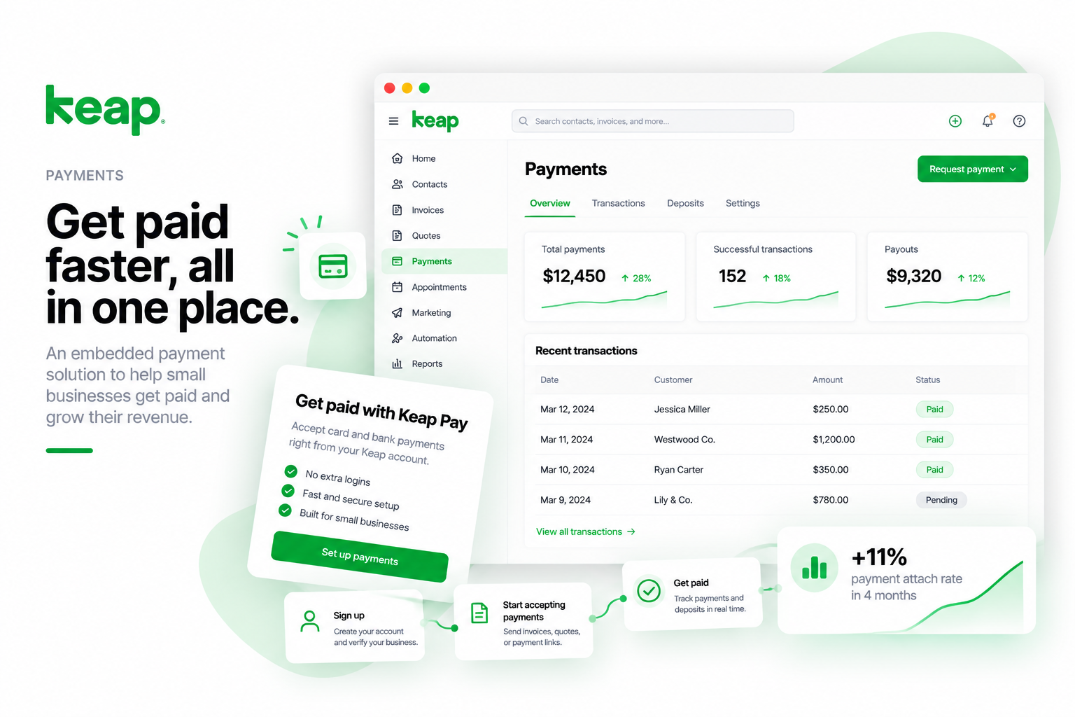
Keap Pay — project cover
01

The trigger — WePay shutdown, five months to replace it

WePay
a Chase company
Deprecated
Platform no longer supported
3rd-party access ended
External integrations discontinued
Acquisition → Shutdown
5-month deadline to replace
70%
70% of merchants migrated on time
Keap Pay
Integrated · Keap-owned
KYC onboarding
Streamlined verification
Payouts
Faster, more reliable
Recurring billing
Built-in subscription management
Oct 2023Migration period begins
5-month deadlineReplace WePay
Feb 2024Migration period ends
WePay (acquired by Chase, third-party integrations shut down) → 5-month sprint → Keap Pay, integrated and Keap-owned. 70% of WePay customers migrated on time. KYC-compliant onboarding, payout dashboard, and recurring billing built from scratch.

Small business owners rely on Keap to collect payments. When WePay was acquired and shut down for third-party integrations, thousands of active merchants faced immediate disruption — invoices they'd already sent couldn't be paid, recurring billing stopped working, and there was no fallback. With competitors launching embedded payments, we had one chance to replace WePay with something better.

The Real Problem
It wasn't just a migration. WePay's shutdown exposed how fragile a third-party processor dependency is. The real mandate was to build an embedded, Keap-owned payments product — not just swap one vendor for another.
My Role
Sole designer. End-to-end UX responsibility: onboarding, payment processing, migration flow, dashboards, and every customer-facing touchpoint. No existing payment component library to build on.
5-month hard deadline
Tied to the WePay shutdown date. Every week of slip meant more merchants without a way to collect payments.
Legal compliance
KYC and PCI-DSS requirements built into every form step. Not optional, not deferrable.
Migration constraint
Could not disrupt active merchants mid-transaction. Every existing payment link, invoice, and subscription had to keep working during the transition.
Engineering constraint
The engineering team was learning the new payment provider's API (Rainforest) in parallel with my design. Design and implementation had to move at the same pace.
Payments UX0→1 ProductOnboardingMigrationFintechSMB
02

Discovery — what merchants actually need

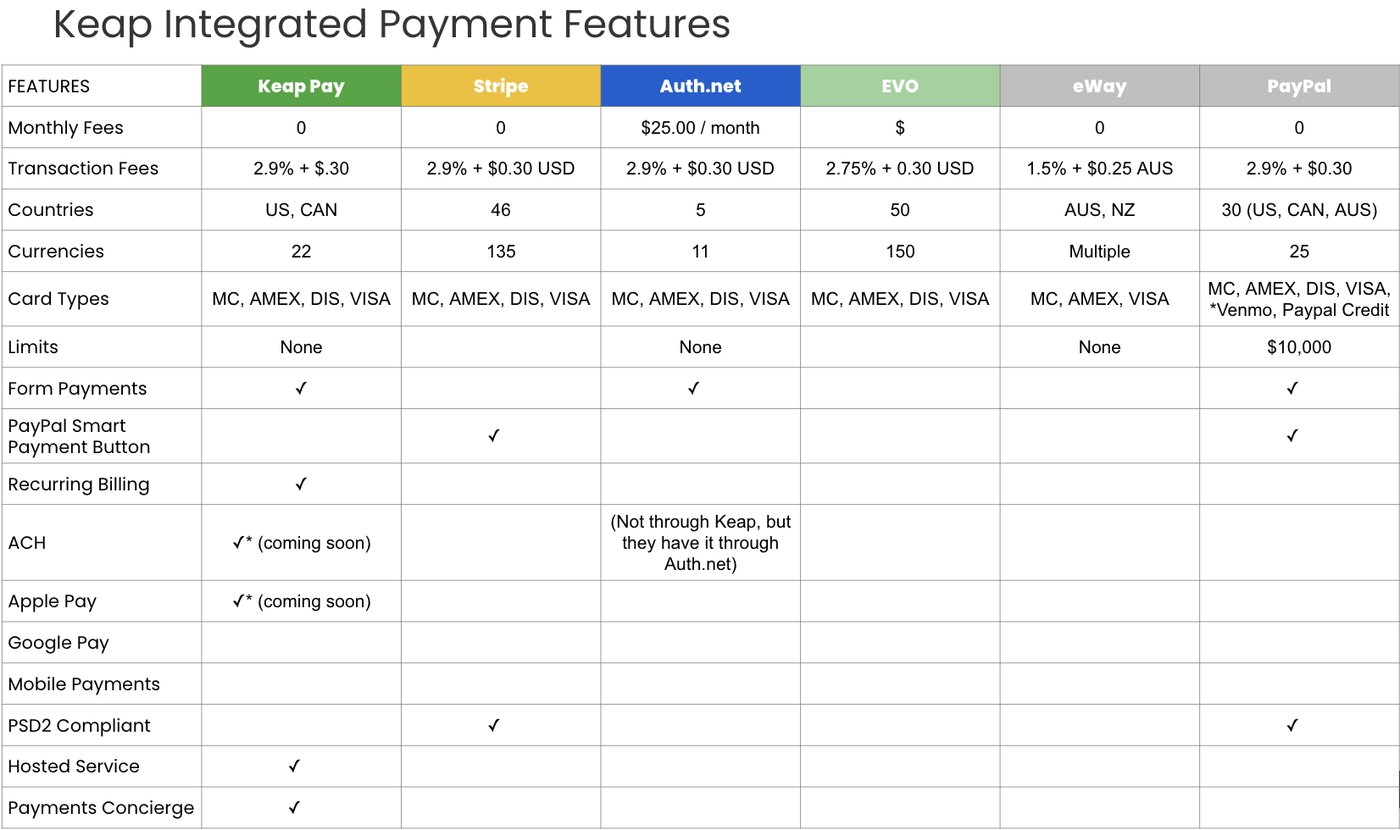
Competitive analysis — Keap Pay vs Stripe, Auth.net, EVO, eWay, PayPal
Competitive analysis — Keap Pay benchmarked against Stripe, Auth.net, EVO, eWay, and PayPal across transaction fees, card types, compliance, recurring billing, ACH, and key differentiators. Keap Pay's built-in Hosted Service and Payments Concierge were unique advantages.
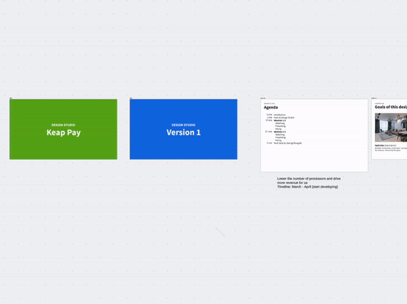
Design thinking workshop — Keap Pay
Design Studio: Keap Pay — cross-functional workshop with product, engineering, and payments teams to align on what "good" looks like before writing a single spec. Covered onboarding questions, user flow sketches, and iteration synthesis.
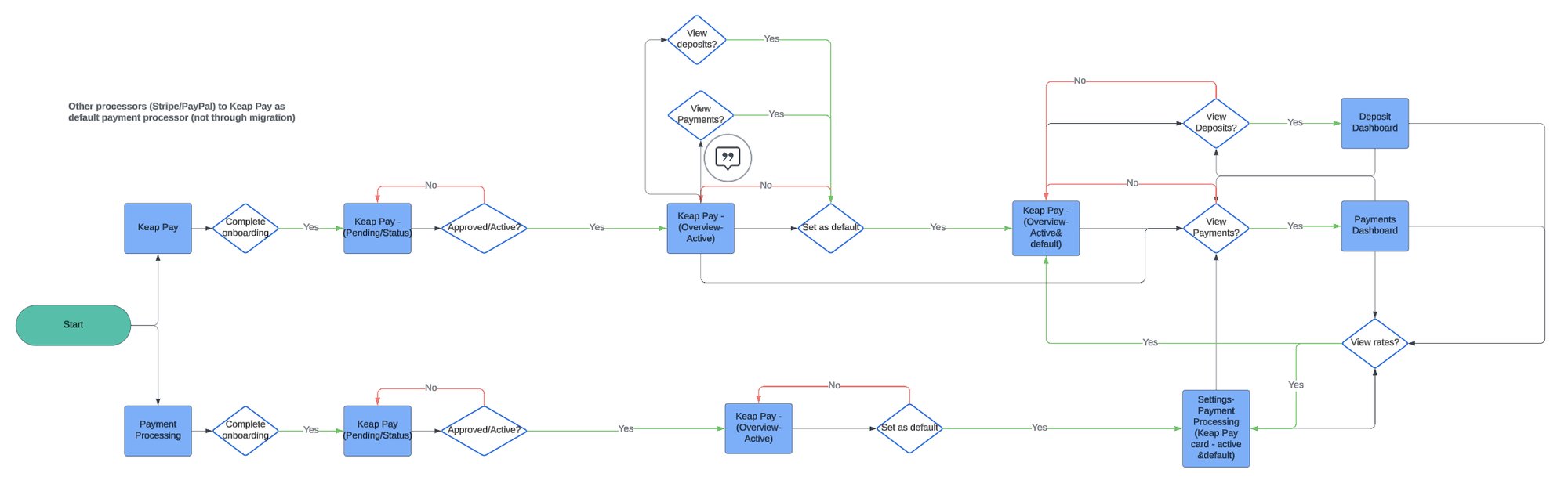
User flow — migration paths
Migration flow — two user paths: existing WePay users migrating to Keap Pay, and users coming from other processors. Both needed to complete the same onboarding and reach the same active state.

Before touching a screen, I ran five discovery interviews with SMB owners currently using WePay — supplemented by competitive analysis across the four processors we were benchmarking against. The goal was to understand the mental models and frustrations of non-technical business owners handling payments, not just the feature checklist.

"I don't know if I set this up right. I just want to know when the money hits my account."
— SMB Owner, Service Business
"The old system asked for so much information and never told me if I was approved. I got anxious every time."
— SMB Owner, Retail
"I'm not a tech person. If there's a payment issue, I need to know fast and know what to do about it."
— SMB Owner, Health & Wellness
P1
Build trust first
Merchants are handing over sensitive financial information. Every screen must signal security, legitimacy, and forward progress clearly — not just legally comply with it.
P2
Reduce cognitive load
Break multi-step forms into digestible chunks with clear progress indicators. Never show a wall of fields. KYC is necessarily complex — the design's job is to hide that complexity from the user.
P3
Transparent payout timeline
Show merchants exactly when they'll get paid. Uncertainty breeds distrust — clarity builds loyalty. This was the most common frustration with WePay and the easiest win to design for.
03

Design — from blank canvas to end-to-end payments product

Rainforest API integration — custom UI components
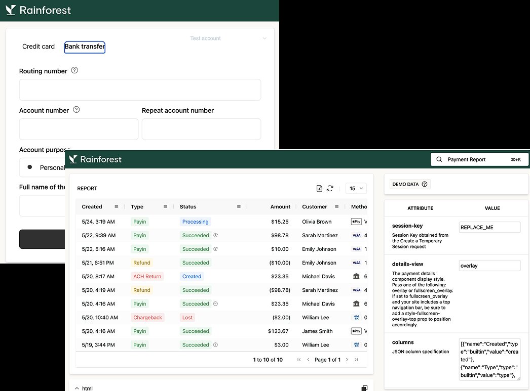
Rainforest API integration — built custom UI components on top of Rainforest's hosted form SDK. Credit card and bank transfer tabs, hosted form with validation, payment report dashboard. All built alongside engineering learning the API in real time.
03a

Custom component library — built from scratch

Custom payment component library
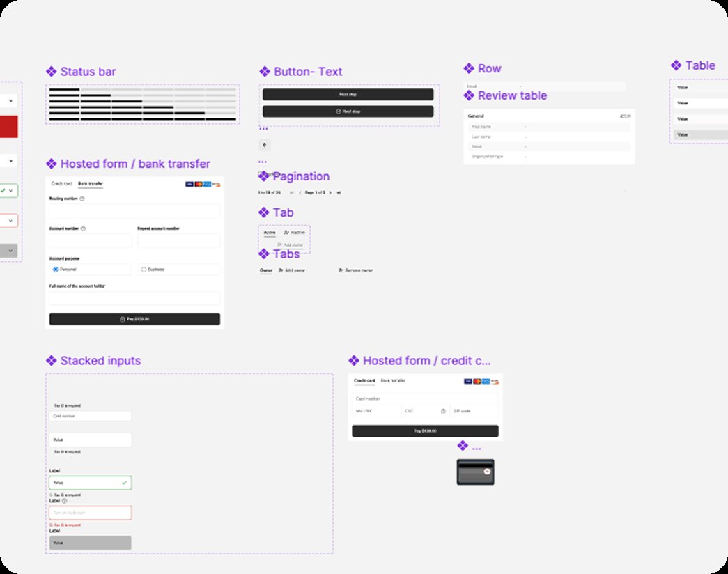
Payment component library built from scratch — status bar, hosted payment forms (credit card + bank transfer), pagination, tabs, stacked inputs, review table. No existing Keap design system covered payment-specific UI patterns, so every component was designed and documented new.
03b

Prototype walkthrough — the flows in motion

▶ Prototype walkthroughs Click to play each flow
Prototype walkthroughs — the 6-step onboarding flow, the payment dashboard, and the sign-up page draft. The final sign-up page (iterated after usability testing) follows section 04.
03c

Payment page — before vs. after

Before — WePay / third-party processors
+
Search
Home
Contacts
My day
25Comms
Sales
Marketing
Automation
Reports
9+
Payment processing and currency
Currency settings
This is the currency the application will use for all billing, payments and invoices.
CurrencyUS Dollar [USD]
Payment processing
Manage how you collect payments from your clients. All Keap accounts are enrolled to accept payments.
wepayA CHASE COMPANY
WePay
Accept Visa, Mastercard, American Express and Discover. 2.9% flat rate + .30 cents transaction, no hidden fees.
Default account
Email
muzzylmz@gmail.com
Account Status
Pending
Manage ▾
stripe
Stripe
2.9% flat rate + 30 cents transaction, no hidden fees.
Connect
PayPal
PayPal
2.9% + 30 cents. Additional identity verification required.
Connect
After — Keap Pay payment page
WePay payment settings page — before
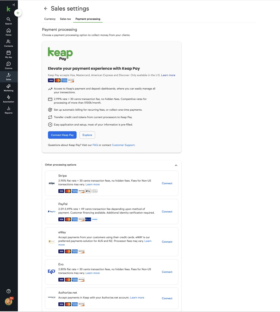
Before (WePay): a third-party processor list with no ownership and generic "Connect" CTAs. After (Keap Pay): a Keap-owned experience with Keap Pay featured prominently and clear value props.
01
Show business name, not just amount
Customers paying an invoice want to see who they're paying. Displaying the business name prominently builds trust and reduces disputes — a small change with measurable impact on completion rates.
02
Inline security cues at the moment of anxiety
Security signals placed near the card field — not buried in footers. Users feel most anxious when entering card details; that's exactly where trust signals need to appear, not below the fold.
03
Dedicated payout dashboard
Built a dedicated payouts timeline view so merchants always know exactly when to expect funds. This eliminated the #1 support inquiry ("Where's my money?") and turned a frustration point into a feature differentiator vs. WePay.
04

Testing — validated throughout, not just at the end

I ran moderated task-based usability sessions throughout the design process — not just at the end. This meant catching issues early and iterating before engineering built the final version. Sessions were recorded and analyzed for hesitation points, errors, and moments of confusion — not just task completion rates.

73.9
SUS Score
"Good" benchmark — above industry average for payment products, which typically score 65–70
40%
Faster signup
After removing redundant KYC fields and consolidating steps based on testing findings
95%
Self-serve setup
Users completed full payment setup without contacting support post-launch
F1
Simplified signup reduced friction
Users completed onboarding 40% faster after we removed redundant fields and consolidated the KYC steps into a clearer sequence. The original form had asked for the same information in two different steps.
F2
Migration path reduced user anxiety
Transparent communication about exactly what would and wouldn't transfer from WePay significantly reduced anxiety in testing sessions — and cut support tickets post-launch.
F3
Dashboard improved payment visibility
Users appreciated the consolidated view of payments and payouts. Several said this was "the one thing WePay never had." One user: "I can actually see when my money is coming. That alone makes it worth switching."
F4 →
Sign-up page had too much text — we iterated
Testing revealed users felt overwhelmed by legal copy on the sign-up page. Redesigned to lead with benefits, move legal disclosure below the fold. Completion rate improved measurably in the follow-up session.
"It was so much easier than I expected. I thought payments setup would be a nightmare."
— SMB Customer, Post-Launch Survey
"I can actually see when my money is coming. That alone makes it worth switching."
— SMB Customer, Post-Launch Survey
04b

The final sign-up page — rebuilt after testing

Testing (finding F4) showed the sign-up page overwhelmed users with legal copy. The final version strips it back to plain-language essentials with inline progress — the direct result of the usability sessions above.
05

Results — shipped on time, trusted from day one

Volume processed
$70M+
Transactions through the new system in the first quarter post-launch
Migration
70%
WePay customers migrated on time, meeting the 5-month deadline
Usability
73.9 SUS
Above industry average for payment products — rated "Good"
Payment volume
+30%
Volume increase post-launch vs previous processor — merchants were transacting more
Self-serve
95%
Users completed full setup without contacting support
Attach rate
+18%
Overall payment attach rate increase — more Keap users enabling payments than before

What I learned

Building a payments product as a sole designer taught me that constraints — hard deadlines, legal requirements, technical limitations — are not obstacles to good design. They're the conditions that make design decisions meaningful. Every simplification I made in the onboarding flow was a decision against something the legal or engineering team wanted to include. Making those tradeoffs visible and getting alignment on them was as much a part of my job as designing the screens.

The most important moment in the project wasn't any single screen — it was the design-studio workshop where we aligned cross-functionally on what "good" meant before writing a spec. Payment products fail when different parts of the organization have different success criteria. Getting product, engineering, payments, and design on the same page early is what made it possible to move fast without breaking trust with merchants.

What I'd do differently: I'd push harder for a payment health dashboard earlier — something that shows merchants not just their transactions, but trends, risks, and recommendations. The current dashboard is excellent for transaction visibility but passive. The next version should be proactive, alerting merchants before issues affect their cash flow.

Payments UXFintech0→1 ProductSMBOnboardingDesign SystemMigration
Next case study
AI-Powered Email Health
View Next →