The employee problem
Questions about enrollment, leave, or balances became emails to HR. Every extra step increased the likelihood of abandoning self-service.
Selected work, by invitation.
Enter the portfolio password to view this project.
Back to selected workEnterprise UX / Employee self-service
One place for employees to find answers, navigate benefits, and complete everyday tasks. I designed a self-service experience around employee needs rather than the structure of HR documentation.
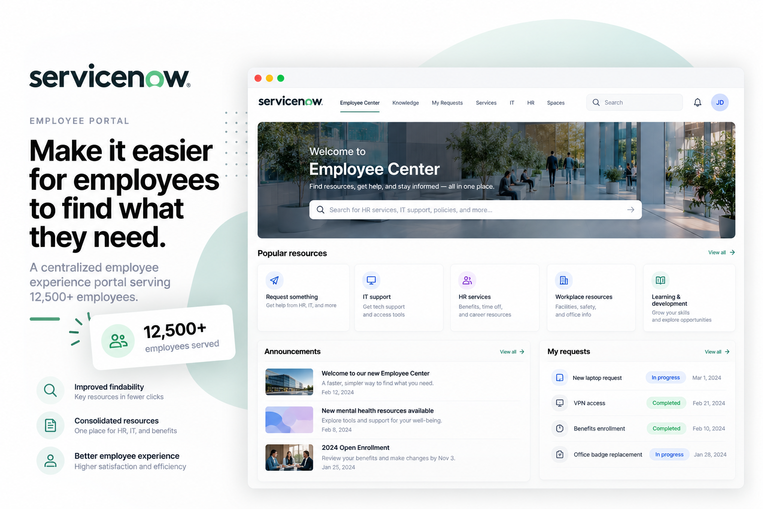
I worked on the end-to-end self-service experience, including research, information architecture, ideation, prototyping, and usability testing with employees across departments.
Shipped work is under NDA. The visuals shown here are representative reconstructions, not screenshots of the shipped product.
Discovery
HR information was spread across documentation and support channels. Employees often knew an answer existed but could not find the information relevant to them quickly enough.
Questions about enrollment, leave, or balances became emails to HR. Every extra step increased the likelihood of abandoning self-service.
Support a diverse employee base with accessible navigation, current policy content, and appropriate care around personal information.
Research reframed the work from better documentation to faster answers and task completion. People wanted to know what a policy meant for them and what they should do next.
Process
Card sorting with 15 employees surfaced seven topic categories. Interviews across departments and tenure levels emphasized findability, personal context, and action-oriented content.
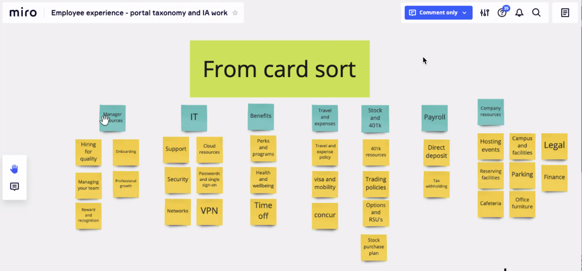
The sorting exercise informed topic categories rather than reproducing the organization's internal HR structure.
Surface relevant benefits and common tasks immediately, instead of asking employees to interpret the whole portal.
A prominent search entry handles specific questions; understandable categories provide a second route.
Use plain-language comparisons and action-oriented labels so people can connect policy information to a decision.
Product Design
The design evolved from a category-led topic layout toward a simpler, content-focused surface with contextual navigation. Representative reconstructions illustrate the direction; they are not screenshots of the shipped NDA work.
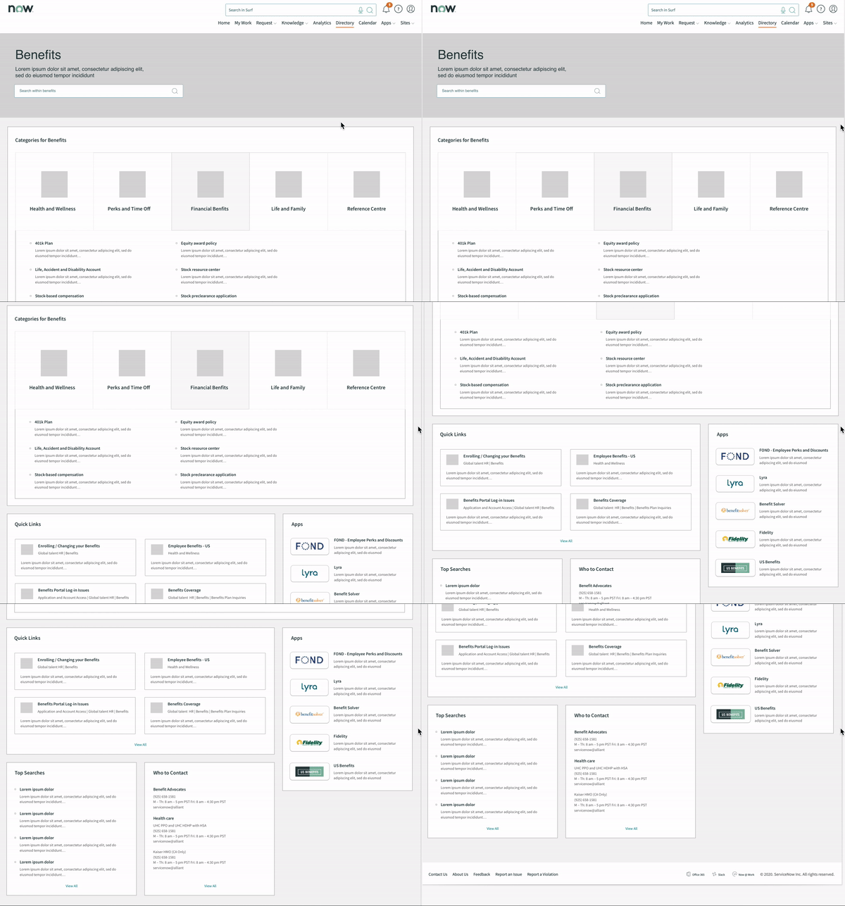
The first wireframe explores category-based navigation and search as the foundation for self-service.
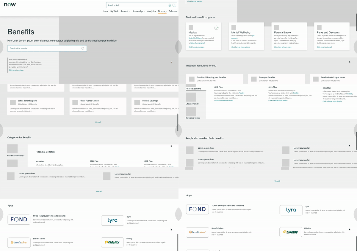
The next iteration simplifies the content area and adds a contextual sidebar.
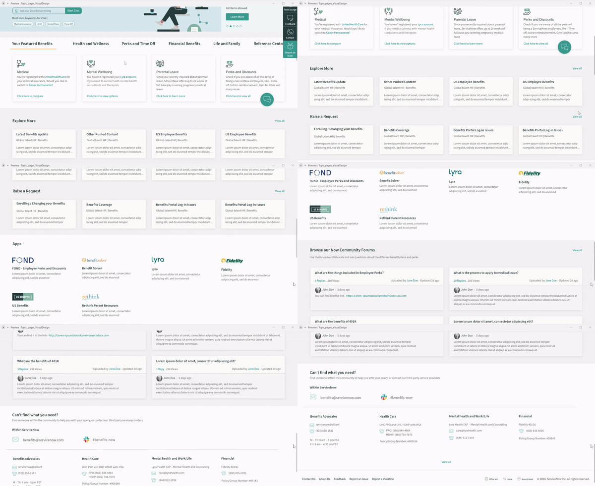
The high-fidelity prototype was used in moderated sessions with ten employees.
Results
Moderated sessions with ten employees supported the clearer organization and personalized navigation. Benefit-card language was refined after jargon caused comprehension problems.
Tasks resolved without HR support, compared with a reported 52% baseline.
Reported improvement in the quarterly HR-experience survey.
Organization-wide reach of the redesigned portal.
The rollout figures are separate from the ten-person usability study. The organization had 12,500 employees; that is not an active-user count.
Plain-language benefit labels and action-oriented calls to action made the second iteration easier to understand.
A useful self-service portal starts with the employee's question and context, not with the organization's document hierarchy.